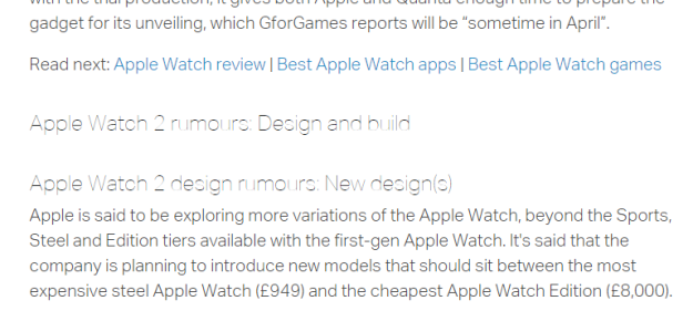
I’m a technology hobbyist; love to follow everything related to technology, especially in relation to mobility. That is probably what attracts me to Apple so much. Anyway, I was on a search for latest news about Apple Watch as rumors are now swirling of an event in March. Anyway, long story short, I came across an article from a blog I don’t commonly follow, Macworld.co.uk. But as I was reading an article about latest rumors, I immediately noticed I was having a terrible time reading it. Here is a snapshot of what I am talking about –
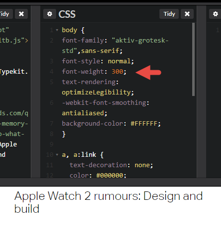
This brings us to the topic of today, selecting a web font, but what is more important UI (user interface) vs UX (user experience)? In my example above Macwrold chose to use a lightweight font called Aktiv Grotesk, a very pretty font, I must say BUT only if used correctly. Like any font, there are many ways to manipulate it, including Font Weight and Font Height. Macworld is using it not only for first heading but subsequent headings. In the example above, h2, has the settings of:
Font Weight: 200
Font Size: 1.5em
Font Weight 200 turns the font into lightweight giving it the modern clean simple look. If we increase font weight to 300, we lose the goal of the font.
That leaves us with Font Size. If you play with the Adobe Typekit or even better, codepen.io, you can fine-tune the CSS settings. After a few trial and error, I discovered that Font Size is best read at 3.1em or 50px as shown below while maintaining the preferred Font Weight:
![]()
So what is your thoughts? When should UI be sacrificed for UI in regards to font? Any other tricky fonts out there?

Hey, thanks for sharing very useful information about UI/UX. Glad to see your other blogs about UI/UX.
LikeLike